

Google Analytics is a great free tool for website analysis. Perhaps you’ve attempted the “Google Analytics for Beginners” course and stumbled upon the question- “which google analytics visualization compares report data to the website average?”.
Or maybe you’re a beginner who’s confused between the different visualizers. You’re looking for the right visualization to compare report data to website average. Hopefully, this post will answer your question and explain it in a simpler way.
Different Views in Google Analytics
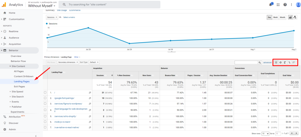
In Google Analytics, you get to choose how you want to see the presentation of data. Some of the views are just ideal visually for a particular kind of data. And sometimes, a view can reveal a totally new kind of information about a site.
There are a number of useful ways for a user to have a visualization of data. For example, a user can choose from the table view, percentage view, performance view, comparison view, and pivot view for different kinds of data.
You can switch between these views very easily. Just look for the date range area on the right-hand side of the page. You’ll see some buttons. These are the ones that change the views.
Visualizer to Compare Report Data to the Website Average
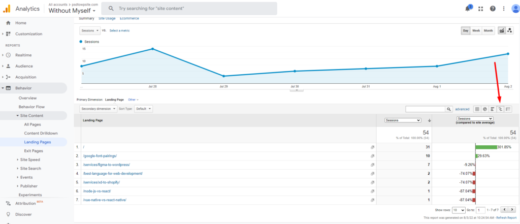
Which Google Analytics Visualization Compares Report Data to the Website Average? The answer to this is- Comparison view.
Suppose you’re looking for a perfect visualizer for the comparison of average website data. In that case, the comparison view is the best choice for you.
Comparison View Explained
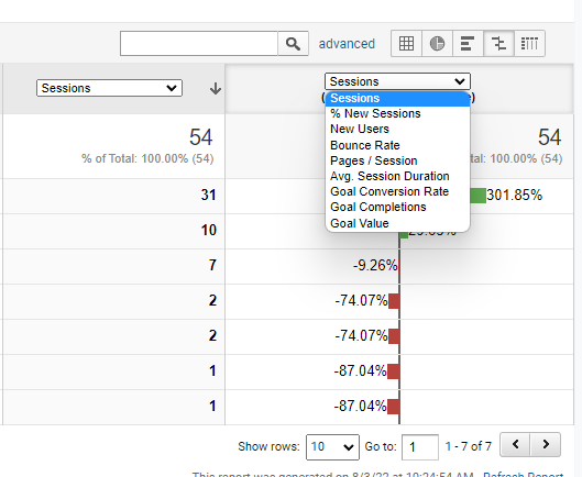
In the comparison view, the report metrics are compared to the website average. In addition, a bar chart plotting the performance of the selected metrics relative to the site average is displayed in the comparison view. A bar chart compares two or more categories by using horizontal or vertical bars.
This view is an extremely useful visualization for comparing data sets. For example, you can compare the bounce rate of a page to the site average with this data view. And average time spent on a particular page compared to the site average.
It can show you all sorts of comparisons against website average. Like, how many users on average visit your site using a PC compared to last year’s average. You can see things like this.
By tracking your current data and comparing it with past data, you can easily see changes. You can take steps when necessary and useful for your business’s future. You’ll find amazing patterns that lead to positive change in your strategy.

Wrapping Up
True, the Google Analytics feature set can be intimidating at first. But with a little time spent, it can be a very useful tool. I suggest you take things slowly and understand what each thing does. A proper understanding of analytics really helps to make decisions about future upgrades.
I hope this has been helpful for you. With the power of Google Analytics, you’ll be able to grow and maintain an amazing website for your company in no time!