
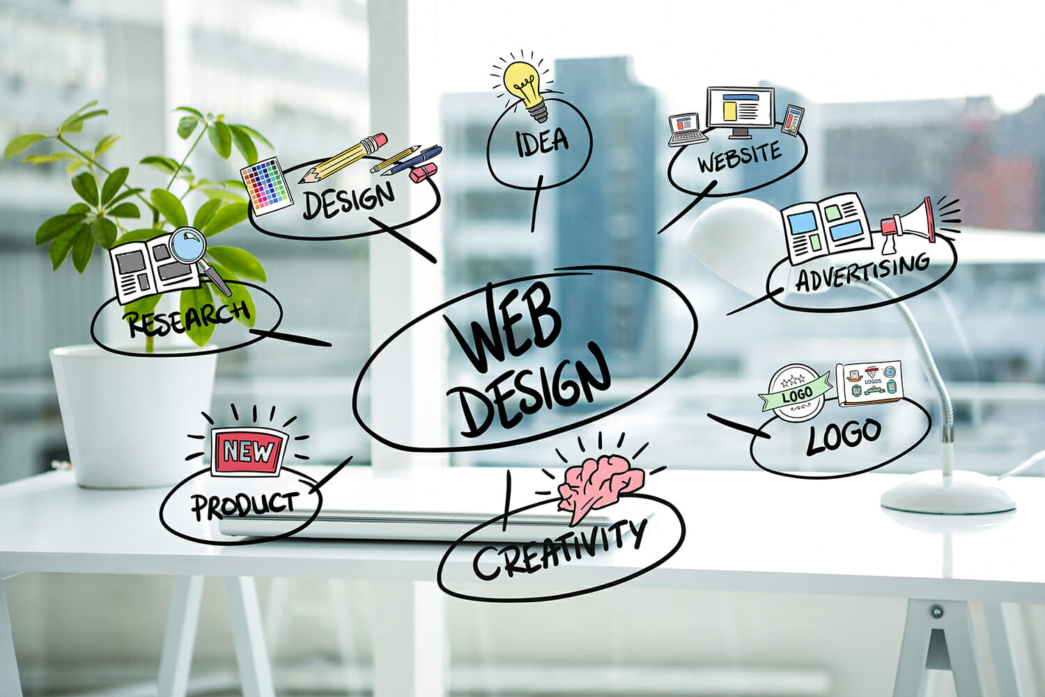
Designing a website can be a daunting task. There are so many things to consider: from the layout to the color scheme to the text and images, etc., you can easily get overwhelmed.
It gets even more challenging when you think about how web designs keep evolving. What worked like magic a few years ago may not work anymore today. So, you have to shape up or ship out. It’s survival for the fittest.
The good news is that with careful planning and adherence to some basic web design best practices, you can create an effective and visually appealing website that will draw in visitors and help convert them into paying customers.
However, in a world where people access 1.9 billion websites, you must ensure that yours is more than just another pretty face.
You have to be on top of things. Design your website for usability, make it user-friendly, and let your customers enjoy interacting with it. Of course, it sounds easier said than done. Right? Don’t worry. We have rolled up our sleeves and did all the heavy lifting for you!
We’ve compiled the best web design practices to help you create a website that’ll represent your company online, tell the world who you are and what you do with a click of a button.
We bet you do not want to be stuck in a rut of regularly tweaking and fixing your website, which costs money and time.
We have explored the styles best-performing websites follow and have determined which approaches, features, and procedures distinguish the unique business websites from the worst.
Here are the best Web design best practices for 2022…
Web Design Best Practices For 2022
Branding
Website branding entails aligning every facet of your site with your company’s personality, from your images and design to your web copy and blogs.
If you want to start or grow a successful business, you must dress the part. For example, you can’t sell CFO services if you appear to be a bookkeeper. Likewise, you can’t establish legitimacy if your clients suspect you’re wearing a gown and slippers at home.
Your website is your presence in the digital world. And to achieve maximum brand awareness and engagement, you need to create an immersive, enjoyable experience for visitors. To create brand awareness for your company, you need to do the following.
Create a Logo
Create a logo and keep it simple. Some of the world’s most recognizable brands use stylized type. If you include a symbol, it does not have to be identical to what you do.
Your logo must convey the spirit of your brand while also speaking to your target customer.
Develop a Content Strategy
As the title suggests, content strategy is a plan of positioning content to convey your brand and its products. They include videos, blogs, and infographics.
These strategies are excellent for demonstrating who your consumers are by extending your website to other platforms such as social media and electronic mail.
In addition, you can highlight what makes your company unique and position your product as the best choice for your intended audience through strategic content marketing, driving more traffic to your website and brand.
Color
It takes some time and thought to determine your website’s best background color. Not only do you need to take into account the contrast between your color choices and your logo, but you also need to use color psychology to appeal to your consumer’s emotions. Finally, the background will establish the tone for the remainder of the web design.
Different colors have different psychological effects. Knowing your target audience allows you to see how a specific color affects mood. Each user has unique experiences associated with different shades, but you can select something that will appeal to the majority of your target audience.
For example, white is the best color scheme for websites, and it is also one of the most popular. It is also neutral, making it ideal to use with anything.
Red is an intense color. It conveys audacity and excitement. It’s especially beneficial for fashion brands and other industries where they require a fresh perspective. In addition, red is a popular background color for web design among authors and musicians.
Blue is one of the most commonly used colors in the design. Blue is a color that both men and women alike represent trust and calm. For this reason, dark blue is a popular color across many bank website designs.
Green carries you back to nature. Companies known for their environmentally friendly nature would use green in their backgrounds. However, this color can also represent nature, like outdoor gear companies.
Font
Online users are quick to pass judgment; it only takes 0.5 seconds to form an opinion about a website, and 94 percent of them base their opinion on design. Since fonts are a vital part of a site’s web design, they are essential for convincing visitors that this is the best page for them.
Subscribers read between the lines to figure out what different fonts mean, and we make snap judgments about websites based on the font styles they see. Different font styles relay various messages to people, such as trust, strength, confidence, stability, creativity, class, and elegance.
A font may look nice, but it’s useless if it doesn’t compliment your brand. So before making design decisions, always keep your brand in mind.
What character does your brand have? Who is your intended audience? Once you understand the answers to these questions, you can determine which font individuality your brand is associated with and begin selecting the ideal font style.
Find a balance between your liking and the needs of your target audience. For example, you may love a specific font but consider your readers. Does this font meet their needs as well?
While fonts must look nice, it’s also vital to be readable. We mostly like a font because it is legible, not because it seems pretty; try to choose a font that not only reflects your brand image but is also fun to read.
Navigation
Innovative website navigation design is critical to the overall success of a brand. Navigation aids the user in comprehending the content of your website and retains them where you want them to be on your website and not someone else’s.
Keep in mind that navigation is not an afterthought. On the contrary, when it comes to the entire web design process, you should consider navigation from the start.
The first step in creating a well-designed navigation menu is to create a hierarchy of details for your menu labels.
For example, assume your brand is a law firm. The navigation menu should be able to
highlight the area of law you specialize in, your legal team, a few testimonials from clients, and your contact information.
List everything and develop logical, quick, and easy-to-understand labels for everything on your menu. “Our contact information,” for instance, may sound stuffy, whereas “contact us” is delightful and friendly.
Less really is more. You convey your message clearly without unnecessary noise by restricting your menu options and maintaining things simple.
For example, you don’t need to show 20 choices on your navigation menu. Instead, consider prioritizing the information and marking it accurately with minimal fuss.
Clear Call to Action ( CTA)
When users visit your website, ensure there are CTAs in various sections, such as your homepage, to give them plenty of opportunities to click through and buy your product.
Make it stand out on the page. A perfect call to action combines persuasive language with excellent design. Use brighter colors to create awareness around the CTA button. Make it stand out and catch the attention of your audience.
Include call-to-actions (CTAs) in your company’s blog posts too. Begin with a command. The purpose of a call to action is to persuade someone to do something. Begin with vigor.
Use persuasive language and action phrases that point people in the right direction, such as “shop,” “join,” or “click.” Make it risk-free. A good CTA promotes a high value while posing little risk to your audience.
Use a no-pressure approach. Make it clear to your audience that they are simply learning more without having to commit to anything.
Instill a sense of urgency. “Take advantage of this limited-time offer before it’s too late!” Some of the most effective CTAs instill a sense of urgency in their message. For example, using a ticking clock with a promo causes FOMO (fear of missing out), a Deaf powerful marketing tactic.
Responsiveness
Responsive design aims to provide the best user experience possible across different platforms, whether you are surfing the web from a PC, laptop, tablet, or smartphone. It arose from the fact that we view content on various screens and that this content should intuitively respond to your screen size.
A responsive website design should include three layouts for various browser widths.
Small: less than 600px is how a standard mobile phone displays content.
600px – 900px is regarded as medium and is how tablets, large phones, and small netbook-style computers will display content.
Over 900px in size. This is how personal computers will display content.
Each of these setups should contain the exact text and visual representations, and they should intend to display that content in the best way possible based on the client’s device.
The user experience is critical; therefore, the responsive design must be more than merely converting a desktop version to a mobile screen. When using a mobile device, we must consider the customer’s experience, interaction, and the vital content they are looking for.
The layout’s structure is critical, especially on mobile. Less is more. The mobile experience, in comparison to the desktop version, is much more centered with a limited amount of space, so how users read and navigate your site must be extremely clear to convey your key message and fully comprehend what the webpage is all about.
Fast loading time (passes google page speed test)
If you can improve the speed of your website, you will have a significant edge over your competitors, who have slower loading times.
You should aim for 3 seconds or less for your webpage to load because many visitors will leave your site if it does not load within 3 seconds—however, the lesser that number, the better.
To enhance fast loading time, do the following things:
Reduce Your HTTP Requests
Each factor on your website generates an HTTP request. I’m referring to scripts images and stylesheets.
The downloading of on-page elements account for a large portion of a website’s loading time. So if you have a lot of these modules on your website, you’ll have considerably more HTTP requests.
You can find out how many queries your site currently makes using the developer tools settings. Then, take steps to reduce that figure. For example, reduce the amount of clutter on your website and streamline the design.
You should also get rid of any unnecessary redirects. While these are frequently required to repair broken links, they generate additional HTTP requests, slowing down the speed of your website.
Enable Browser caching
As previously stated, when someone visits a new website, all of the elements must load . These elements are saved in a cache, a temporary storage location on their hard drive. So the next time they visit that website, their browser will be able to load that page without sending an additional HTTP request to the server.
If you allow caching, your website will load faster for returning users.
Accessibility
It’s critical to understand how to make a website accessible while designing or developing an online presence for your company.
Many of the finest website builders make the process easier, and even the top web hosting services now offer some guidance, but it’s still necessary to prepare ahead.
Making a website fully accessible will expand your consumer base by guaranteeing that anyone with an accessibility difficulty may still read it in the way you desire. You could improve the accessibility of your website by;
Adding Captions to Your Video and Audio
Not everyone who uses the internet process information in the usual way. Hearing-impaired people, for example, will be unable to obtain information from films and sound snippets.
They will be able to understand the content you’re presenting on your website if you include captions to video and audio.
Keep the following suggestions in mind when doing so:
- In one caption, subjects and phrases should be grouped together.
- Speakers should be identified.
- Captions should show at the same time as the audio. Describe noises that are heard but not seen, such as a knock, ringing doorbells, and gunshots.
- Alternative (alt) text is used when images are not visible to everyone. For example, a short textual description of a picture, often known as alt attributes or alt descriptions, is used to aid visually impaired people with the information presented.
- When an image fails to load, it can also be utilized in its place.
- Screen readers will interpret your information if you add short but informative alt text to each photo on your website.
- Some visitors will simply skip these images if they don’t have alt text, or they will try to make out your content based on the picture’s file name.
Maintain Hierarchy
Page hierarchy refers to the organization of pages on a website in a ranked order. A visitor can start on the main page and then drill down through several menus to find the page they’re looking for.
This process should be simple if the web hierarchy makes sense. If you don’t, the page your user is looking for may never appear. Here are a few pointers to maintaining the hierarchy.
So, take a pause and consider your blog’s, online store’s, or business’s objective.
If you work for a bigger company with several website stakeholders, make sure everyone is on the same page. You can obviously, agree on multiple sub-goals for different portions of your website. Remember to write down these objectives for future reference.
You can maintain hierarchy by:
Making a broad overview.
Have a look at the content you have. Do this by using a simple spreadsheet. You may not want to include all of your pages in this sheet if you have hundreds of them. Your pages will likely fall into a specific department or category, such as your blog, services, or product pages. Alternatively, if you have an online store, you presumably have some high-level categories that you can refer to in your spreadsheet rather than each specific product page.
Cleaning up
If you examine your spreadsheet carefully, you may discover that some pages need to be modified or erased. Alternatively, it could be that large sections or subcategories should be transferred, combined, or split. You may come across pages that are still helpful but no longer appear appropriate for your menu. You don’t want your upper menu to appear cluttered, so remove them.
Avoid a wall of text
Lengthy paragraphs and broad columns of text are not conducive to website visitors’ reading styles. The large columns of text, in particular, might make the reader feel as though they are becoming lost from one line to the next.
Depending on your typeface, font size, and page layout, a slightly broader or narrower column may be required. Visit your favorite online media sources and examine how wide the column is on their pages in context to get a feel for comfortable column widths.
Use headers -You can use headings for various purposes on your website. They serve as excellent resting areas for a website user’s eyes and help recap the page’s content.
When a visitor skims down on the page, they ought to read only the headings and get a sense of what is covered and where this can be found. Make use of graphics. Using photographs or graphs to show data might help break up a wall of text.
Visual information mixed throughout your written content can also provide an additional short form of communication. Visuals are simple to comprehend.
Make your paragraphs and sentences shorter. Use paragraphs 2-3 sentences long to make the text on the page less thick.
A/B Testing
Split testing, commonly known as A/B testing, is a coldly scientific method of comparing variables in your business side by side to find which of the two variables works better.
The foundation of any online marketing is traffic. To attract visitors to your website or landing page, you must do something (advertise).
Subject your Ads to A/B testing. To increase the quantity of traffic, you’re getting, test your title, copy, images, CTA, and any other aspect of your ad. In addition, when visitors arrive on your page, you must persuade them to provide you with their contact information voluntarily.
Most marketers provide a lead magnet, often known as an “ethical incentive.”
Free surveys, white papers, eBooks, short online classes, and other valuable content can be used as lead magnets in return for permission to reach them. To find out, run A/B testing on your lead attraction, landing page, contact page, selling process, and other offer aspects.
Because you’ll know which factor works best after testing each one, you’ll be able to boost your opt-in rate.
Make Your SEO Strategy More Effective
In all forms of internet marketing, SEO optimization is essential. A Facebook campaign, and every other eCommerce site, for example, must rely on this method to expand their reach. By being more particular and including more search terms, you can better reach your target markets.
Longer searching strings with more relevant terms yield better results. Take advantage of the fact that many searches now include more phrases with pertinent additions in the row. Boost your SEO campaign by:
Using the Appropriate Keywords
When searching for particular information online, keywords are phrases or specific words people type in the search bar.
Consider using distinct keywords related to your sector or business in your Text or email content, as well as any other information. Consider conducting keyword research to help you focus your efforts.
Unless earth opens up and swallows all your online competition, you must understand that your keywords may benefit your competitors if you are not meticulous. Be specific and tailor the keywords to draw visitors to your site.
Include a Mobile-Friendly Version
When we speak about a mobile-friendly website, we’re referring to the presentation of a different version of your website to users viewing it on a mobile device to provide them with a better experience.
Your consumers, clients, and business partners aren’t picky about the device they use, whether it’s a desktop, laptop, or smartphone. Instead, they simply want their information delivered quickly, accurately, and conveniently.
And the smartphone in their handbag or back pocket is typically the most convenient device. As a result, it’s now a commercial requirement to offer your website across all devices, with a special focus on mobile users. When your site is rendered on a small screen, there are three faults to prevent:
- Text that cannot be read or images that can’t be deciphered without enlarging or scrolling
- Tap-targets that aren’t evenly spaced
- Content that isn’t playable
Ensure that when people visit your website using a mobile phone, they can play the content, zoom images, and tap targets effortlessly.
Conclusion
To say that a website’s design is vital is an understatement. Your website’s success is ultimately determined by the design decisions you make.
You can make every website better. Use this list as a reference to assist you in making such improvements.
Don’t get too carried away. We’re not suggesting that you implement all of these design ideas right away, but you should start somewhere.
Always keep in mind that every website is a work in progress. You’ll gain an advantage over your competitors if you make an effort and constantly fine-tune your webpage.
It makes no difference if your website is fresh new or has been around for decades.
Just implement these best web design practices if you want to gain an edge over your competition.
4 comments on “13 Web Design Best Practices In 2023”
Comments are closed.